Design
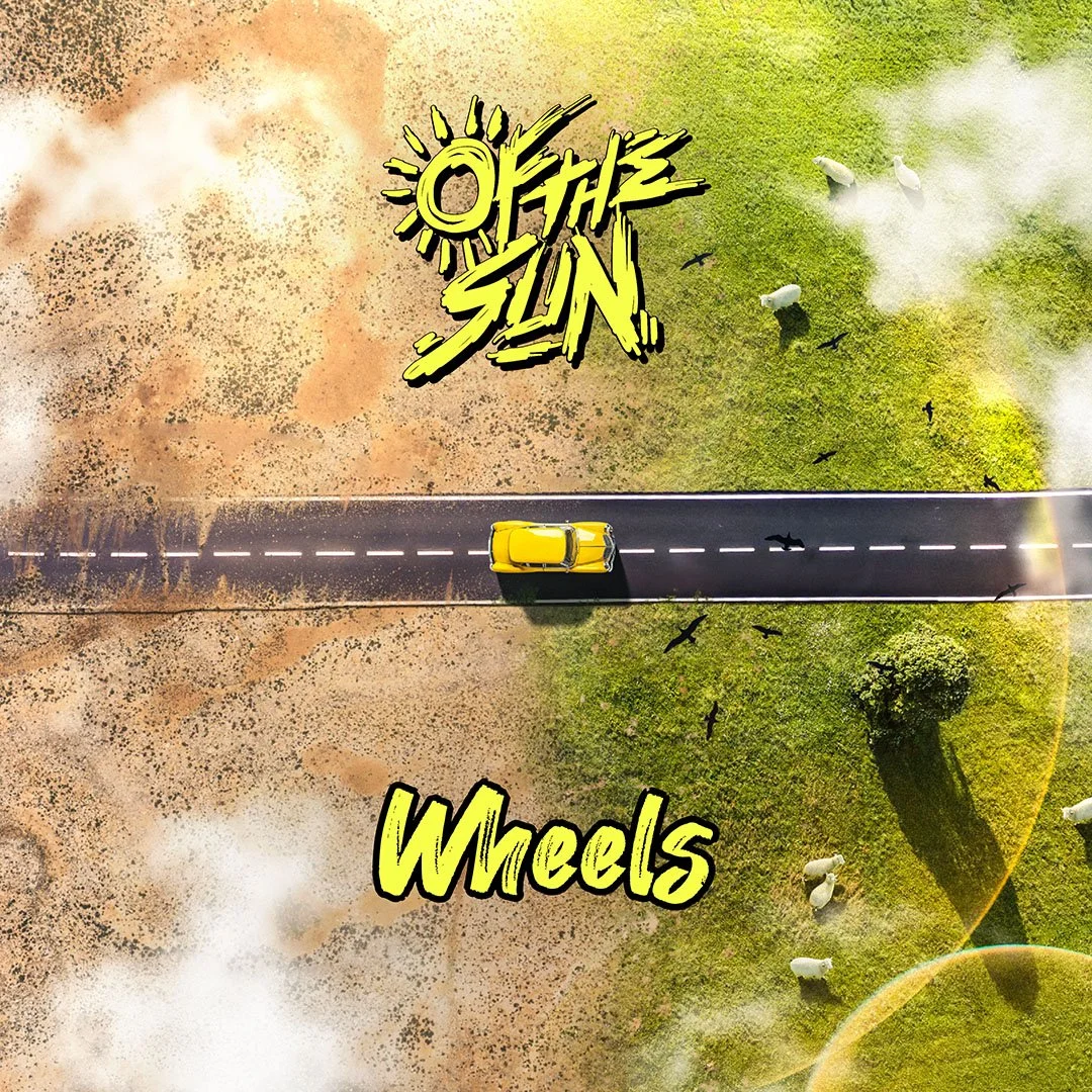
I had the pleasure of creating the cover artwork for the new single “Wheels” by the pop-rock band Of The Sun. The song is all about moving on in life; letting the past rest, getting the wheel moving again and working towards a better future.
The cover artwork reflects the past as a desert that symbolizes the challenges and setbacks we may face in the past, while the road and the meadow show the way to a better future.
Oct. 2024

I have been working with the punk rock band "Bad to Worse" from the USA since the very beginning of their branding. After I initially created their key visual – the bomb – for them, I developed the logo, the rest of the corporate design and then some advertising materials such as business cards, T-shirt designs, graphics for various online platforms and the intro for the music video of their first single release.
May 2024

New choirmaster, new songs and new, young singers.
The Men's Choir Radebeul has been around for 180 years now and it's time to reinvent itself once again. Of course, this also includes a modern look for the print media.
Business cards, flyers, notices and roll-ups have been designed so far and a lot more is still being planned.
Apr. 2024

As part of the final project of my apprenticeship, we had to set up a fictitious advertising agency. Together with my friends Caro and Clara, we joined forces as a group of three to form the creative agency "farbfest" and created a complete corporate design.
This includes logo, colors, shapes, fonts and designs for business cards, letterhead, envelopes and T-shirts. All packed into a style guide.
Oct. 2022
In the second part of the final project of my apprenticeship, we had to work on a fictitious customer project for our creative agency "farbfest". For that we continued a logo project from the previous school year.
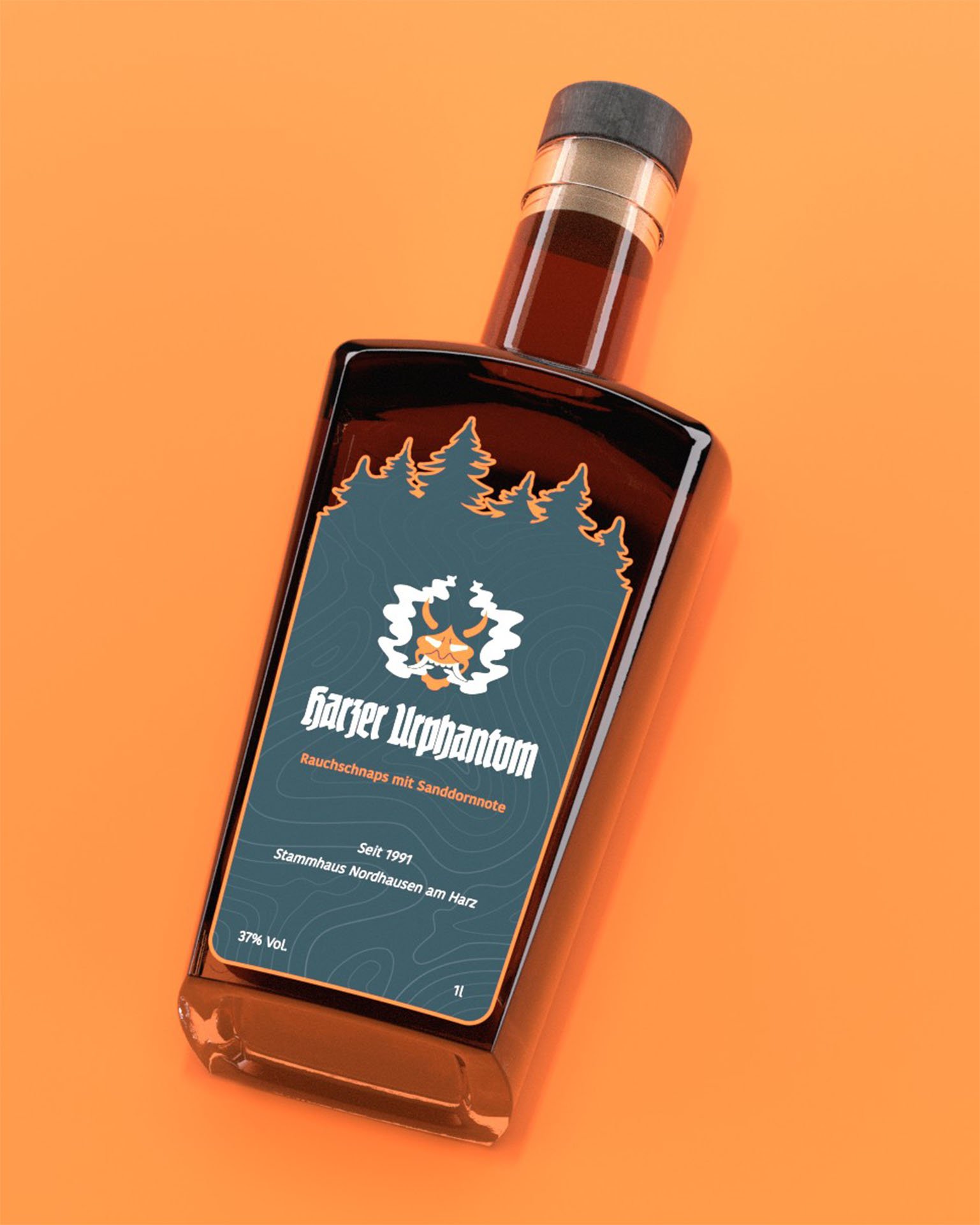
Harzer Urphantom is a smoky schnapps with a hint of sea buckthorn, which is being distilled in the small family business Stammhaus Nordhausen am Harz since 1991.
Apr. 2022

A friend has been beekeeping with her boyfriend for several years and has started selling surplus honey. The name "Bienen König" had been decided, so the task was to create a corresponding corporate design. It should represent the value and regionality of the honey in a modern look.
In addition to the logo, colors, shapes and fonts, I created designs for the label, business card and letterhead.
Feb. 2022
